SISA Energy Design System
Design System | UI Design
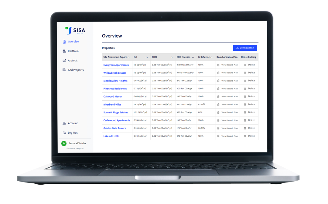
This design system was created to address a critical need for both consistency and scalability. Starting from scratch, we built it to align with web accessibility standards, prioritizing uniformity and usability.

Project Details
Client: SISA Energy Inc.
My Role: Product Designer.
Team: Kyung Min Song, Yoyo Chen & Sejin Oh.
Timeline: 2 months.
Tools: Figma, Miro Board, Font Awesome 6 Pro, Microsoft Teams, Stark.
Problem
Different developers contributed to the product’s development without adhering to any standard guidelines, resulting in diverse structures and styles. The existing code presented challenges for reusability or scalability. And last but not least, web accessibility hadn’t been addressed or considered at all.
Achievement
Produced a cohesive design system prioritizing web accessibility and uniformity. It establishes standards for data visualization and front-end development, working as a foundation for scalable and consistent components.
Design System
Components
Color
Brand Colors
These are the SISA Energy official brand colors.
Neutral Colors
These are used for backgrounds, texts and shapes. They support the semantic colors, and sometimes used for disabled states.
Semantic Colors
These colors are used to convey standard value states. They have the same meaning in all contexts.

Labels, Input Fields, Selects & Text Areas
Labels
Labels need to describe the purpose of the form control.
Explicit Association
The label element is used to associate text with form elements explicitly by matching the for and id attributes of the form control.
<label for=”firstname”>First name:</label>
<input type=”text” name=”firstname” id=”firstname” placeholder=”Enter your first name”>
<input type=”checkbox” name=”subscribe” id=”subscribe”>
<label for=”subscribe”>Subscribe to newsletter</label>
<label for=”province”>Province</label>
<select id=”province”>
<option value=”None” selected disabled>Select province</option>
<option value=”AB”>Alberta</option>
<option value=”BC”>British Columbia</option>
</select>
Hidden Label
Sometimes, the purpose of an input is clear without the use of a label by the context provided visually. However, we need to provide code support to the assistive technologies so that the context is clear.
There are three possible approaches to make this element accessible.
1. Hiding the label element
The
2. Using aria-label
The aria-label attribute can also be used to identify form controls. This approach is well supported by screen readers but the information is not conveyed to visual users. This should only be used when the label of the control is clear from the surrounding content.
3. Using aria-labelledby
The aria-labelledby attribute can also be used to identify form controls. This approach is well supported by screen readers but the information is not conveyed to visual users. This should only be used when the label of the control is clear from the surrounding content.


Controls
Checkboxes
It is not only important to associate the label to the input in a checkbox, but to make sure that when the user clicks on the label the checkbox will be activated as well.
Radio Buttons
A radio button is a checkable input that when associated with other radio buttons, only one of which can be checked at a time. The radio buttons must be grouped together in a radiogroup to indicate which ones affect the same value.<p id=”legend”>True or False?</p>
<div> <span role=”radio” aria-checked=”false” tabindex=”0″ aria-labelledby=”label-one” data-value=”True”></span>
<label id=”label-one”>True</label> </div>
<div> <span role=”radio” aria-checked=”false” tabindex=”0″ aria-labelledby=”label-two” data-value=”False”></span>
<label id=”label-two”>False</label> </div> </div>Grouping Controls
When grouping controls, it is important to use the <fieldset> element so that the assistive technologies can read it properly.
<p id=”legend”>True or False?</p>
<div> <span role=”radio” aria-checked=”false” tabindex=”0″ aria-labelledby=”label-one” data-value=”True”></span>
<label id=”label-one”>True</label> </div>
<div> <span role=”radio” aria-checked=”false” tabindex=”0″ aria-labelledby=”label-two” data-value=”False”></span>
<label id=”label-two”>False</label> </div> </div>

Buttons
Primary bUTTONS
These are the SISA Energy official brand colors.
sECONDARY bUTTONS
These are the SISA Energy official brand colors.
tERTIARY bUTTONS
These are used for backgrounds, texts and shapes. They support the semantic colors, and sometimes used for disabled states.
tEXT bUTTONS
These colors are used to convey standard value states. They have the same meaning in all contexts.


Alerts
Alert Text
These are the SISA Energy official brand colors.
Alert Banner
These are the SISA Energy official brand colors.
Alert Dialogue
These are used for backgrounds, texts and shapes. They support the semantic colors, and sometimes used for disabled states.
Detailed Alert
These colors are used to convey standard value states. They have the same meaning in all contexts.


